Spanish Designs
Spanish Designs: European Design with a Filipino Soul
Spanish Designs came to La Siesta with a clear mission: to communicate its unique value as a bridge between the best of Spanish and European interior design and the emerging markets of Southeast Asia. Our task was to develop a visual and verbal identity that would reflect their meticulous, honest, and deeply human approach — always maintaining the sophistication inherent to the design they represent.
The brand acts as a link between two worlds. On one side, their deep knowledge of European signature design and exclusive access to brands not available in the region. On the other, a strong service-oriented mindset that translates into close collaboration, tailor-made solutions, and an unwavering commitment to their clients — from architects and interior designers to private customers.
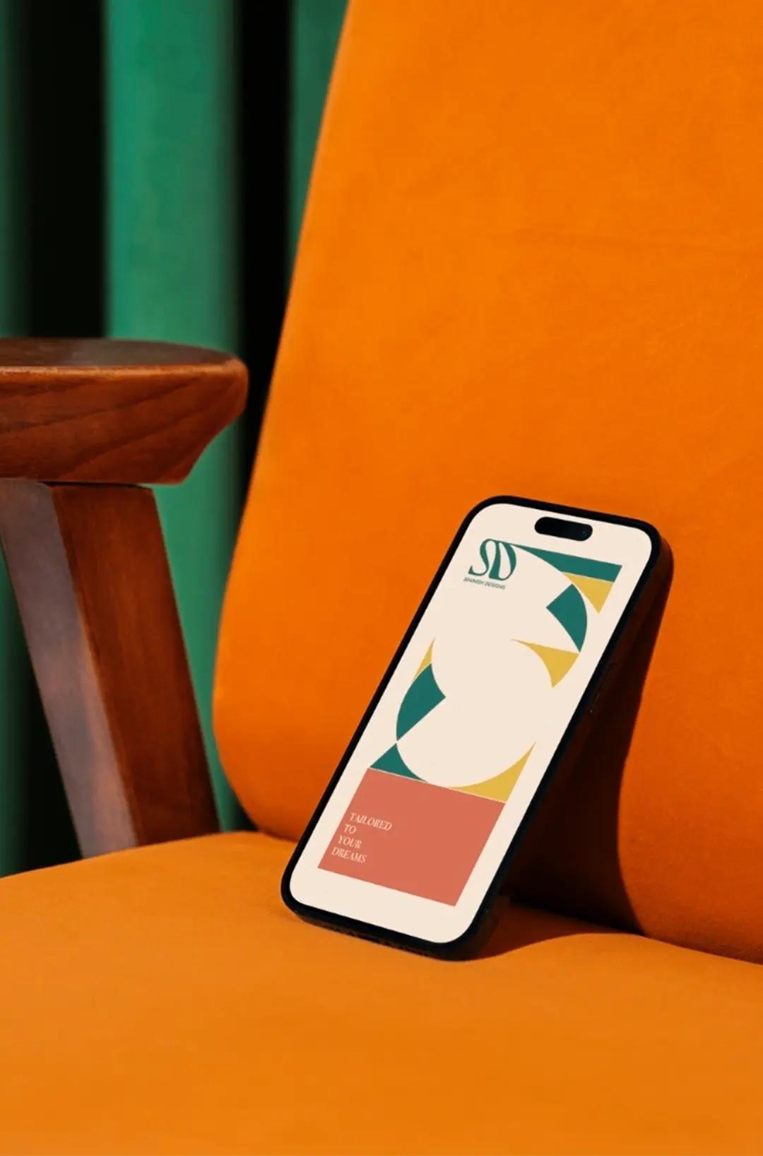
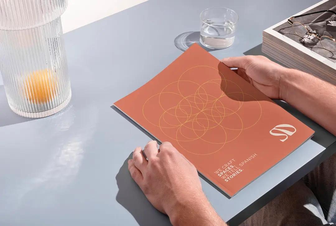
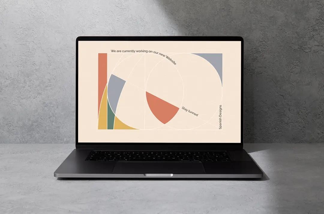
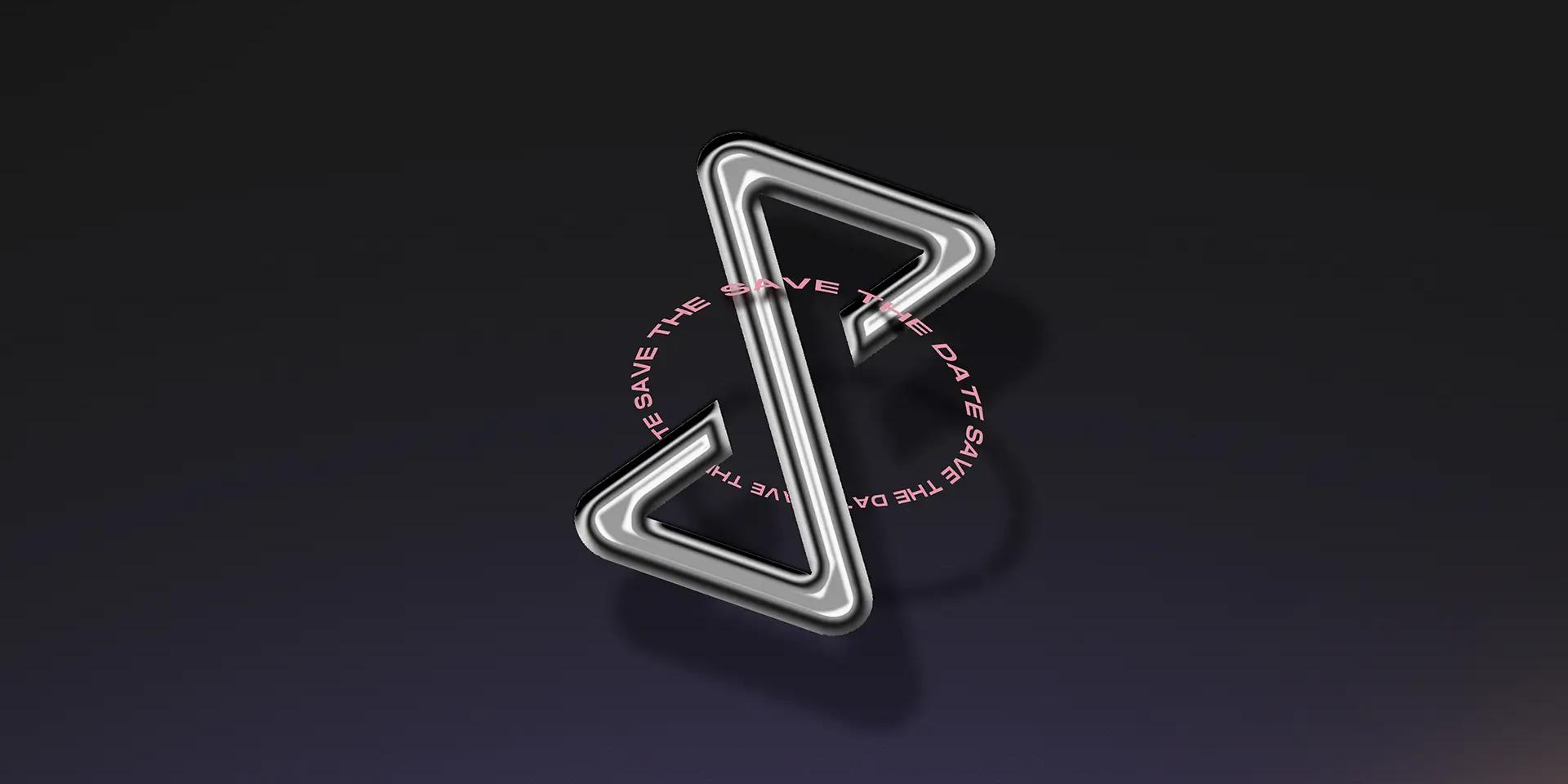
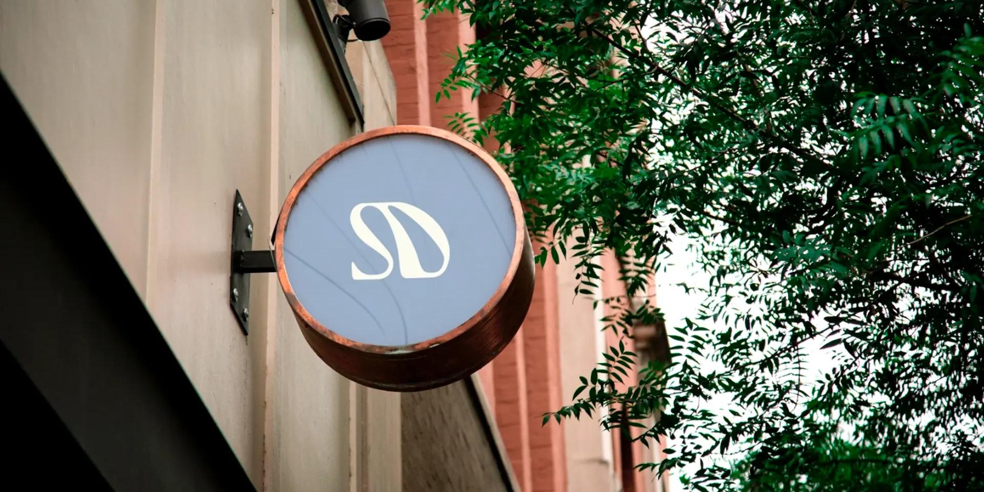
We worked with archetypes that reveal their essence: the Caregiver, the Creator, the Sage, and the Magician. This translated into a visual identity that blends modular and organic elements, sophistication and warmth. We designed an elegant serif logotype inspired by tradition, craftsmanship, and the forms of Art Deco and Catalan Modernism, paired with geometric elements, soft textures, and a color palette that evokes Mediterranean warmth: mustard, terracotta, aquamarine, and off-white.
Every detail of the branding was designed to reinforce their positioning as a reliable, approachable brand with a true passion for authentic design. In short, a brand that — as their tagline promises — turns any idea into a space with a story.